
Inngest's new design: Our process in rethinking our information architecture
The Inngest Design Team · 8/8/2024 · 7 min read
Inngest is getting a new look, with a cohesive theme and clearer navigation. We are thrilled to roll out this new design based on community feedback and built with the many users who participated in the design process.
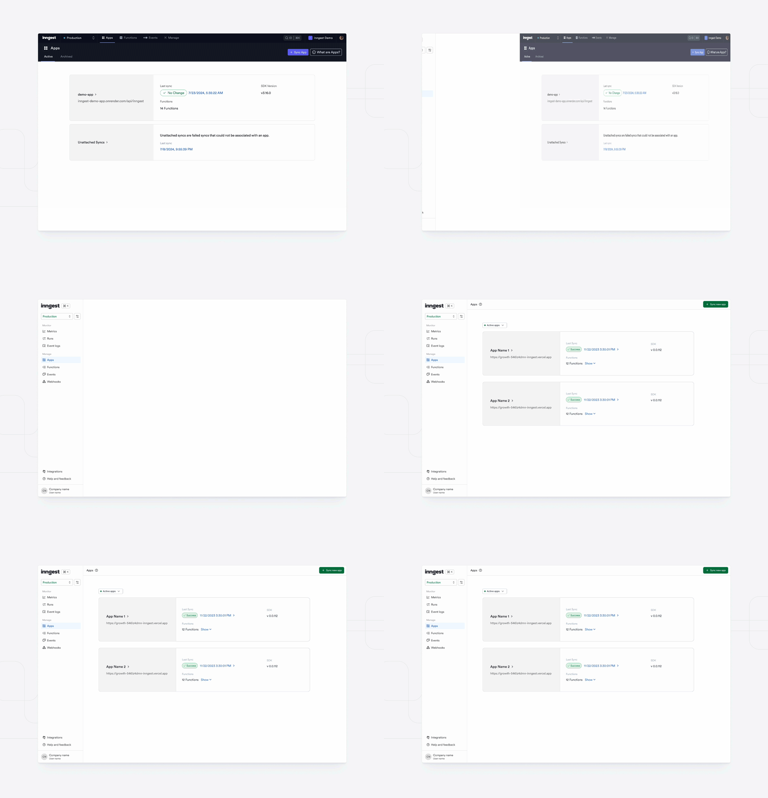
This project follows feedback on the challenges of navigating the Inngest's UI. Based on this observation, this new design results from a complete reimagining of the Information Architecture (IA) of Inngest Cloud Application and Dev Server.
In this blog post, we will explain IA, and cover how we identified the pain points of the previous UI and built this new design.
What is Information Architecture?
Information Architecture (IA) is the backbone of any product's content structure. It's all about organizing content hierarchically so that everything is displayed in a clear, logical manner. When done well, Information Architecture makes it easy to see how different pieces of content relate to one another. This means that not only is the information itself easy to find and understand, but the functions and features of the product are also straightforward to locate and use. Good Information Architecture is like a well-designed map, guiding users effortlessly through the product, ensuring they can find what they need without frustration or confusion.
The Problem with our old IA
Information Architecture was a common source of pain for our users. Sometimes it was brought up explicitly, and sometimes implicitly. Some examples: Users were having difficulty navigating and finding specific parts of the Cloud Application, such as Webhooks. Understanding environments was a common friction point. And Users gave feedback on how inefficient locating specific functions and runs was. That being said, the common theme was easy to see: our IA needed a reimagining. Inngest's Design team had conversations with our users in order to dig deeper into the problem and learn more. In the process, we established the following goals to guide our redesign of Inngest's Information Architecture:
- Enhance the overall developer experience through an intuitive navigation system.
- Reduce the learning curve for users by ensuring consistency across products.
- Align the IA with our users' mental models.
- Establish a scalable IA foundation that supports both current and future functionalities.
- Provide users with high-level observability.
Process
Before putting pixels on the page, Inngest's Design team conducted several user research sessions utilizing different methodologies. The research started with a card sort exercise, inviting a diverse group of users to organize content in ways that made sense to them. This provided us with valuable insights into user perceptions and interactions with Inngest's features.
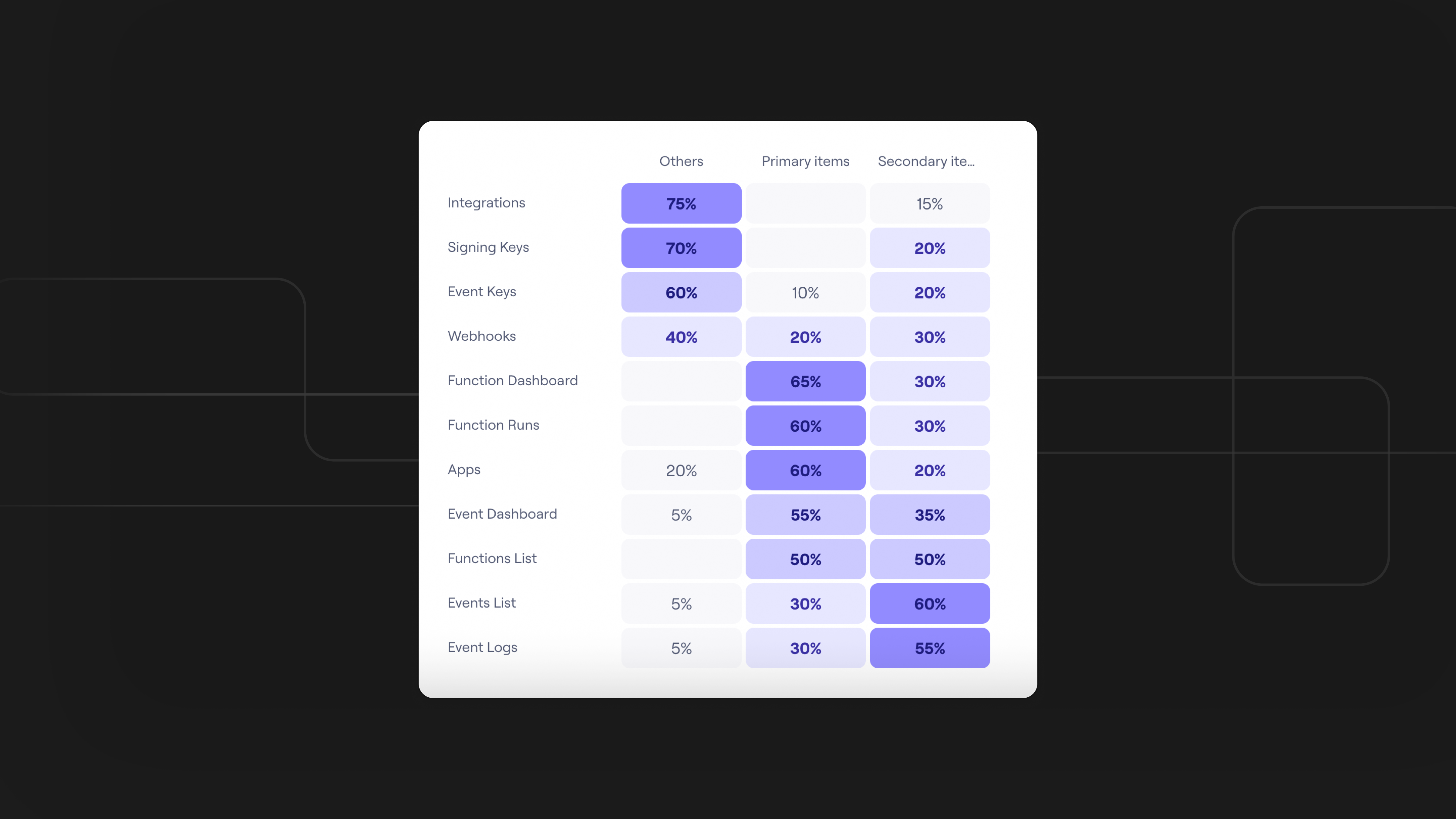
Next, we began to formulate hypotheses on users' current interactions with Inngest, and how they would desire these interactions to improve. What our users found valuable within Inngest, from a functionalist perspective, became more apparent and backed with quantitative data. In order to further validate these hypothese, we conducted user interviews with different user archetypes to gain qualitative insights, complementing our quantitative data.
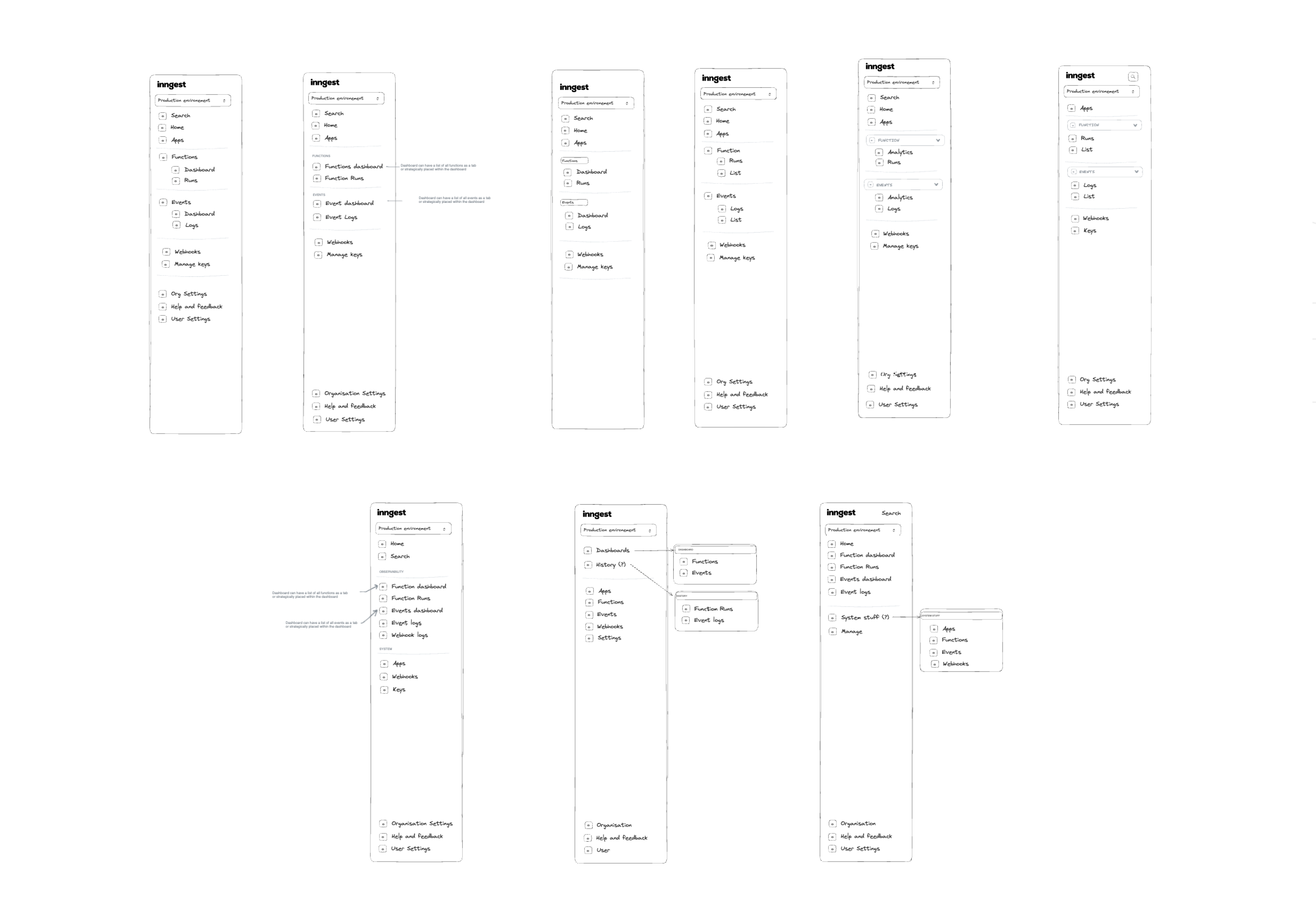 We explored various iterations of organizing information, as seen in the graphic above.
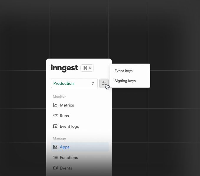
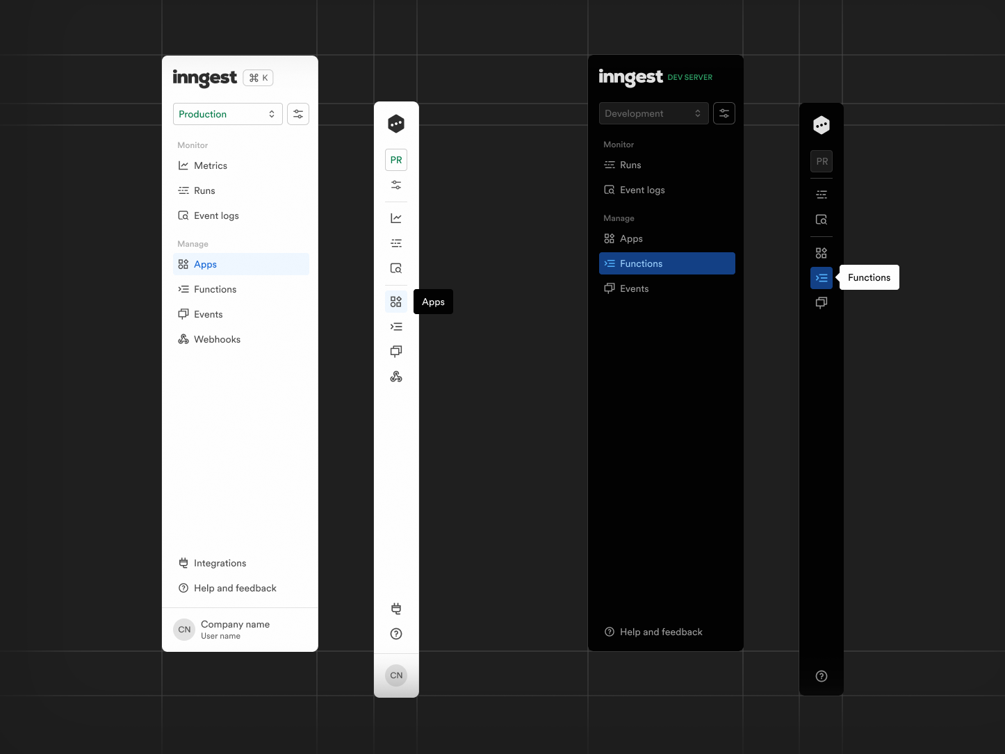
We eventually landed on grouping navigation elements around the user's intent when visiting the Inngest dashboard: to Monitor and to Manage
- Monitor gives the user tools to proactively and reactively debug, troubleshoot, and observe their systems built on Inngest. In the monitor grouping, you will find features such as the updated global runs view, and the in-progress observability dashboards.
- Manage allows the user to see and make changes to the structure and/or resources/entities of their system (Apps, Functions, Events, Webhooks) and is organized to reinforce users' mental model of Inngest. Additionally, we rethought the way that environments are displayed in order to give the user more clarity to which environment they are currently in.
How the new Information Architecture simplifies navigation
Enhance the overall developer experience through an intuitive navigation system
By organizing information into two primary interaction modes, Monitor and Manage, we have created a navigation system that aligns closely with the natural workflow of our users. This intuitive structure allows developers to quickly find and use the tools they need, enhancing their overall experience and making their interactions with Inngest more efficient and satisfying.
Reduce the learning curve for users by ensuring consistency across products
Our new IA offers consistent navigation and layout across both the Dev Server and Cloud Application. By standardizing the navigation and layout, we ensure that users can easily transition between these two environments without needing to relearn the interface. This consistency significantly reduces the learning curve and helps users become proficient more quickly. Before, users had difficulty switching between the Dev Server and Cloud Application because they differed in design. Aligning the functionality, layout, and terminology between the Dev Server and the Cloud Application reduced the cognitive load and made transitioning between the two environments a seamless experience for the users.
Align the IA with mental models
The Manage section is specifically designed to reflect the Inngest mental model, making it easier for users to understand and navigate the app. By aligning the IA with how users think about their systems, we improved usability and created a more intuitive experience that feels natural and logical to our users.
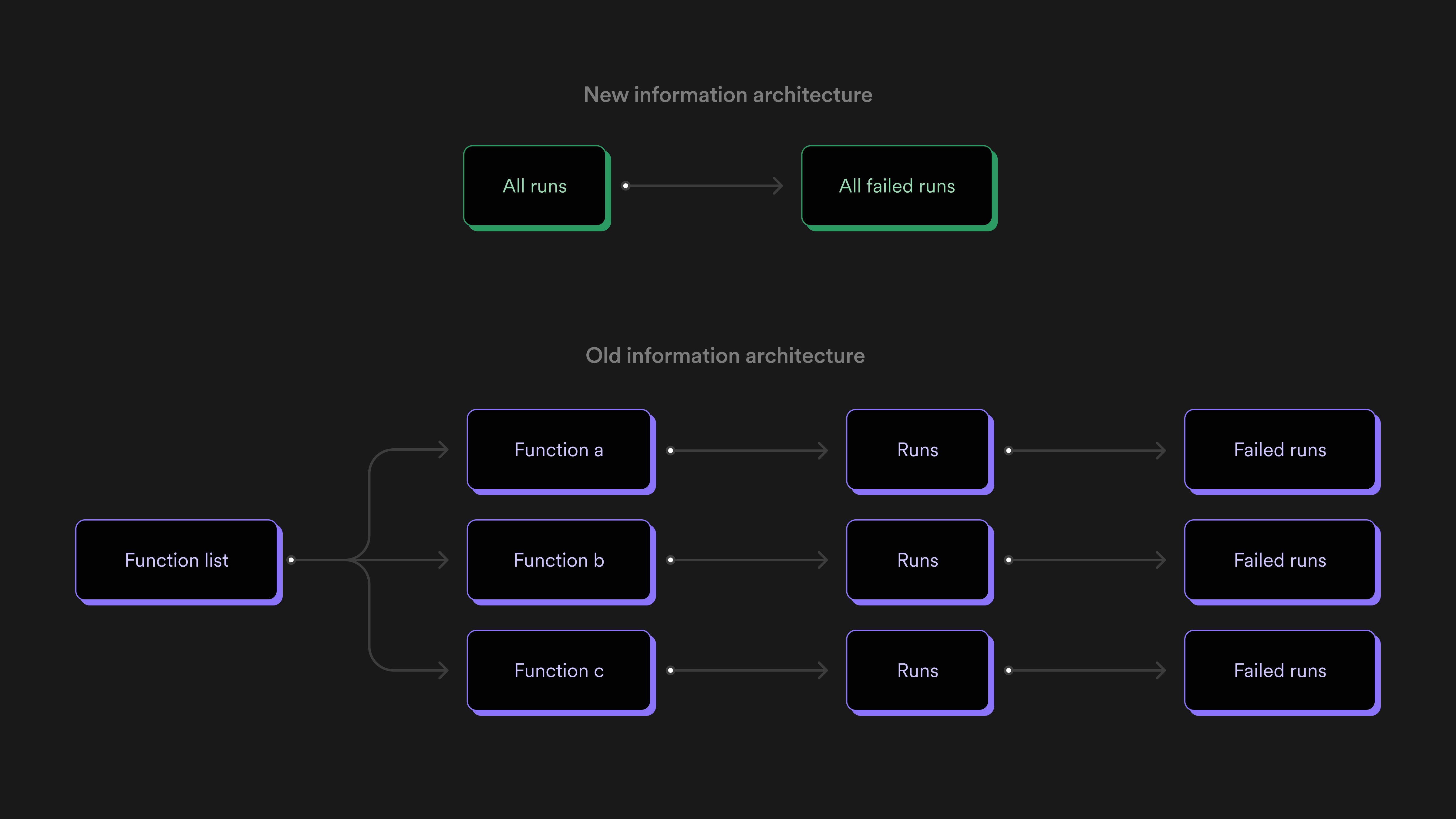
For example, previously, if users wanted to find their most recent failed runs in the Cloud Application, it would require them to dig into the functions page and manually sift through individual functions. Now users can go to the Runs page under Manage and quickly sort the data by all failed runs.
A future-proof navigation
The new structure is designed to be scalable, allowing us to easily incorporate new features and functionalities in the future without major overhauls. Now our IA can grow and adapt as Inngest evolves, supporting both current needs and future developments.
Quick access to observability features
The Monitor grouping offers tools for debugging, troubleshooting, and observing systems, providing users with the clarity they need to understand workflow and system performance. Global runs and our in-flight monitoring dashboard will be found under this section.
Conclusion
We have many exciting features in the works, and we'll continue to share updates and insights into our design process. Stay tuned for more from the Inngest team as we enhance the developer experience.
And, of course, we would love to hear any and every piece of feedback you have! Share it with us on Discord or our roadmap.
Help shape the future of Inngest
Ask questions, give feedback, and share feature requests
Join our Discord!